In 1985, Nintendo shipped a game with two buttons that taught millions of kids to play without a single instruction. That same year, Apple and Microsoft shipped interfaces that taught billions of people to click through menus. Forty years later, we're still clicking. Every app you use today runs on the same interaction grammar that shipped 40 years ago. Nobody decided to keep it. Nobody decided to change it either.

TL;DR
Most software forces you to navigate menus before you can do anything. Games like Super Mario Bros. took the opposite approach: one button, many meanings depending on context. This essay traces how the "menu-shaped" interaction grammar became the default, why it compounds with every new feature, and what a new generation of tools is doing to bring context-aware, intent-first design back to productivity software.
Most software feels … competent.
It loads. It syncs. It has dark mode. It has keyboard shortcuts. It politely reminds you about features you'll never use. The UI looks clean, the typography is tasteful, the animations are smooth. It took us a long time to get here from the early computing days. Yet despite all this progress, using many modern apps feels like doing paperwork inside a vending machine.
Click. Click. Click.
Wrong click.
Back.
Click again.
Now you're in the right place, but it's the wrong setting.
You scroll.
Then you scroll again because the scroll container is inside another scroll container.
Ting!
You've got a Slack message. Your coworker can't find a button. They need to click it asap.
You reply asap-er.
Come back.
And now you're wondering why you're looking at a scrollable list inside another scrollable list on a screen you thought was right because your mind has left the room.
You wanted to do one simple thing. The interface made you do twelve things first: navigate screens, read labels, open menus, compare options, just to arrive at the action you already had in mind.
A lot of software isn't difficult. It's just… menu-shaped. Everything you can do is hiding behind multiple layers of menus, labels and settings, and your job is to go hunt them or peel layer by layer.
Here's a small example you've probably lived through. You want to stop one app from buzzing your phone.
That's a six-word intent: turn off notifications for this app.
But here's what actually happens: Settings → Notifications → scroll through an alphabetical list of every app on your phone → tap the app → face a screen with twelve toggles, half of which say things like "Time Sensitive" and "Scheduled Summary" → guess which combination means "just stop" → toggle something → hope it worked.
A six-word intent just became a forty-step treasure hunt through someone else's organizational logic.
We do this all day long. On every device. For work tools and personal apps alike. On the most flexible machines humanity has ever built.
In language, grammar is the small set of rules (subject, verb, object, tense, punctuation) that lets you generate infinite meaningful sentences from a finite vocabulary. Interfaces have a grammar too.
Interaction grammar is the set of inputs an interface gives you (click, type, drag, swipe) and the rules that decide what those inputs mean in context. When that grammar is rich, a few inputs can express a wide range of intentions. When it's poor, you end up clicking through menus.
Most software today is running on a primitive interaction grammar, one that hasn't meaningfully evolved in the last forty years. Companies keep adding features on top of it, which only makes the maze bigger. AI can ship interfaces faster, but it doesn't automatically make them less menu-shaped. Slop is still slop, just cheaper to generate through AI.
Software is stuck with a broken interaction grammar. But a plumber from 1985 already solved this by design.
What Super Mario Teaches About UX and Interaction Design
Why World 1-1 still feels magical?
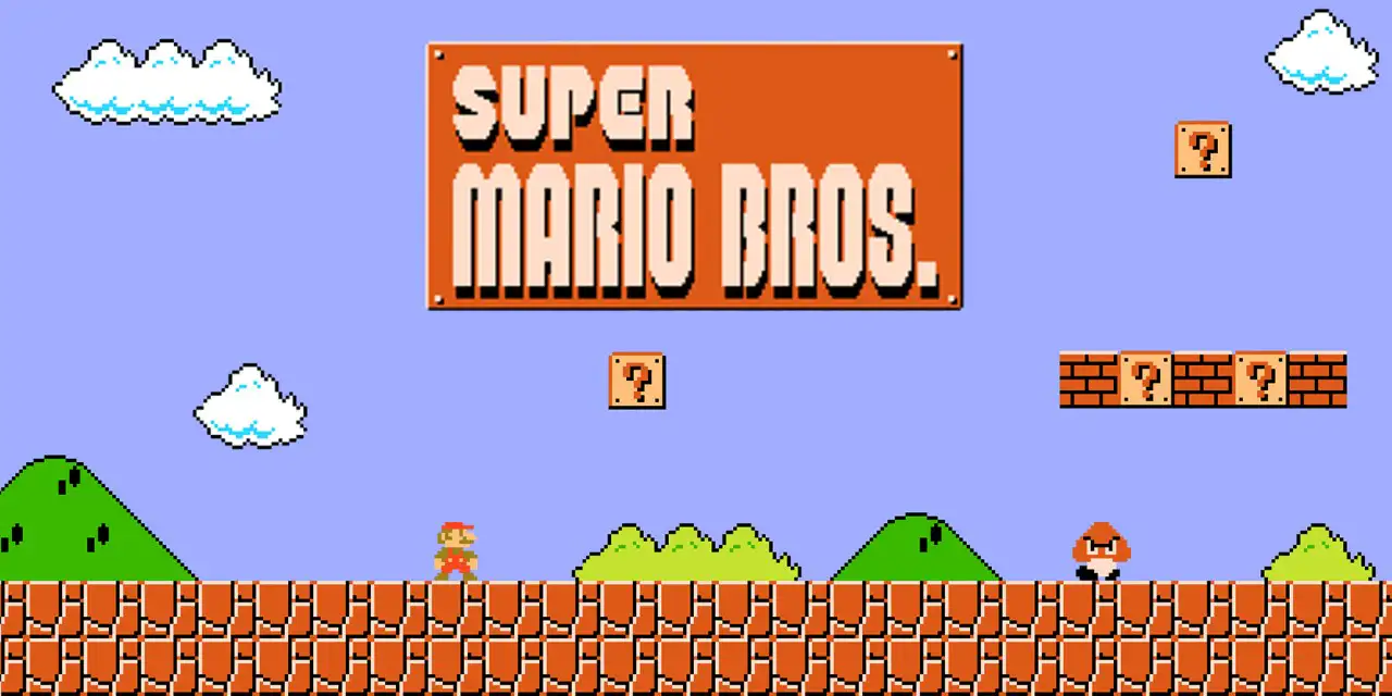
Super Mario Bros. for the Nintendo Entertainment System (NES), like me, was many people's first game. A kid doesn't want to read a manual. So how do you design World 1-1 for an excited kid holding a controller for the first time?
A Goomba (small angry brown mushroom) is walking toward you. You try to go back and realize the screen ends there. The only way is forward. If you touch the Goomba, Mario dies. The only way to survive is to jump over it. You mash buttons until you find the one that jumps. Fortunately, there aren't many buttons to mash.
Congrats! You've just learned your first interaction: jump over the Goomba to avoid death.
But what if you accidentally jumped onto the Goomba? It dies. You've now learned that timing your jump can kill enemies. Soon after, you learn that if you jump into the glowing [?] bricks, you get coins. Sometimes you get a magic mushroom.
One Verb, Infinite Leverage
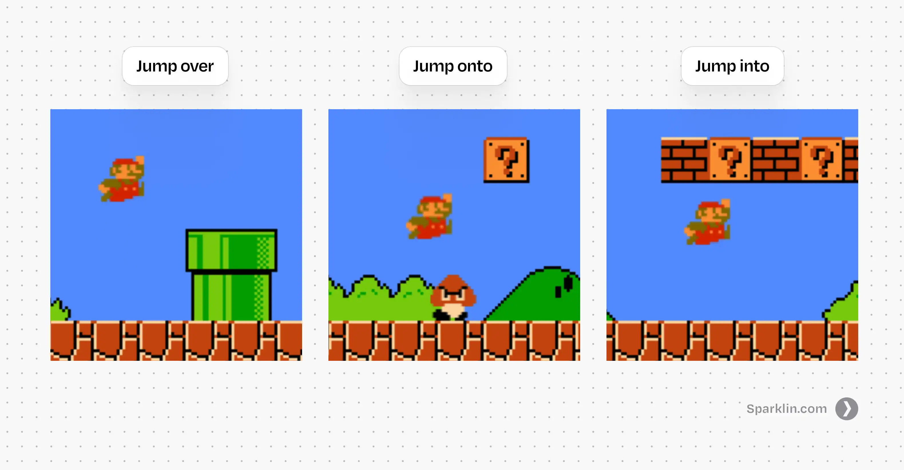
So what just happened? You pressed one button: jump, and the game extracted three completely different meanings from it. Jump over to dodge, jump onto to kill, jump into to collect.
One input. Three meanings. Nothing changed about the button; the situation changed. Nobody explained any of this. No tutorial, no tooltip, no onboarding flow. The system taught through consequences, not instructions, and it stuck precisely because you discovered it yourself.
Each new context made that single button more powerful.
This is what I'm calling verb leverage: the amount of meaning a single input can carry across different situations. When verb leverage is high, you don't need more buttons. You need more contexts. The grammar stays simple. The meaning grows.
Mario's verb leverage only increases from there. Jump over gaps. Jump onto moving platforms. Jump into hidden blocks. Jump to not die in the exact way you died twenty seconds ago. One verb, and the game keeps finding new ways to make it matter.
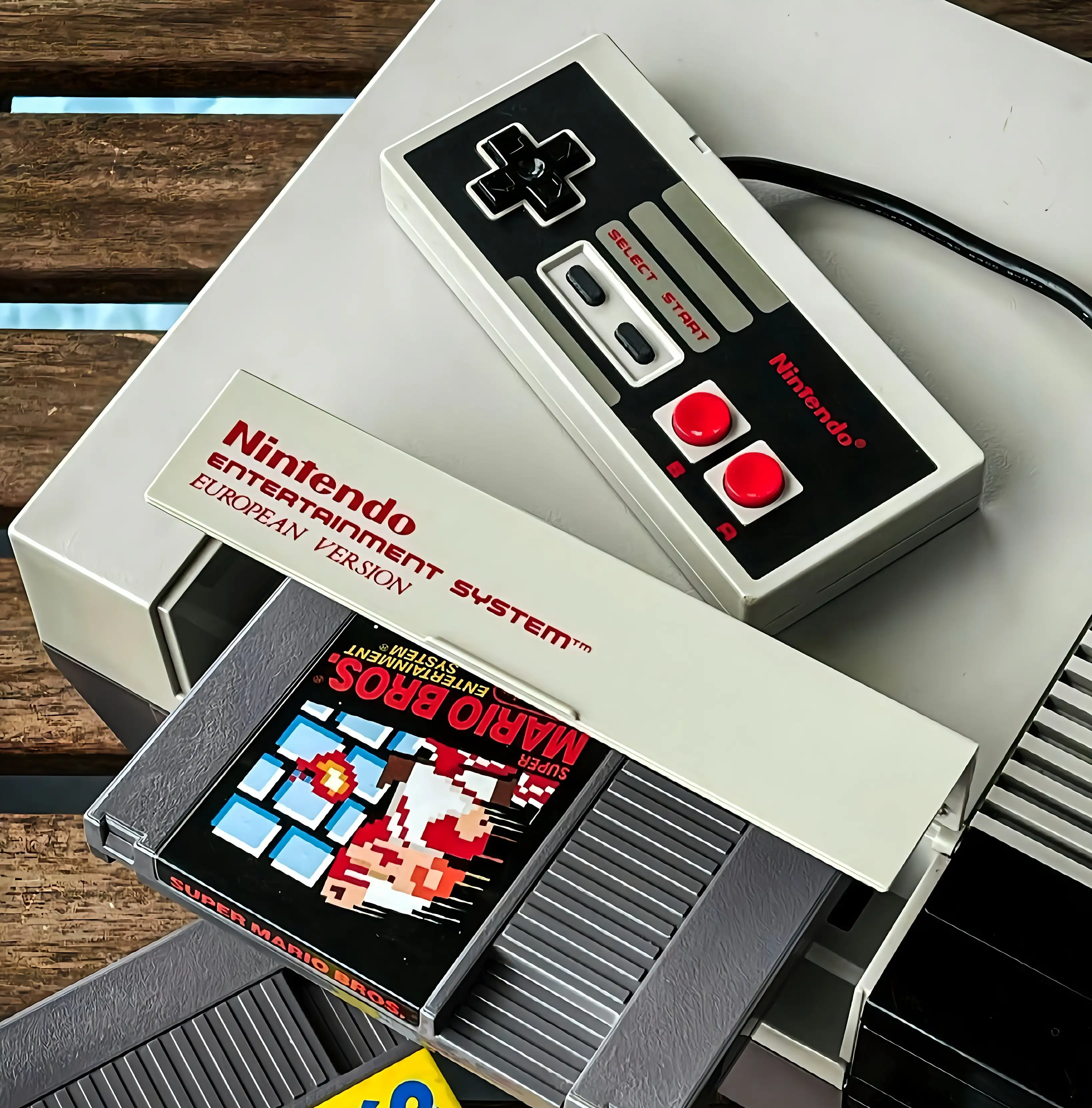
Now look at how Nintendo built this. The original NES controller had a Directional pad (D-pad), two action buttons (A and B), Select, and Start. That was it. Every jump, run, swim, and fight in Super Mario Bros. emerged from just two buttons. The constraint was the design. They didn't have the luxury of adding a new button for every new feature. So instead, they made a small set of inputs change into dozens of meanings depending on context.
Hold the right arrow and Mario walks. While walking, hold B and he runs. While running, press A and he jumps farther. It sounds complicated when you write it down. But every kid figured out they could hold both buttons at the same time, and nobody had to explain why it felt graceful. Nintendo prioritized the feel of interaction above everything else. By many accounts, they spent a huge portion of their development schedule crafting and perfecting the basics of movement before even starting on level design. Levels could be assembled late because the feel had to be right first.
That's the trick: teach a verb, then keep changing the world around it. Don't add more verbs. Don't add a tutorial for each new mechanic. Change the context so the same input means something new, and let the player discover the meaning themselves.
A typical software designer would solve this differently. Three interactions? Three buttons. One to jump, one to break bricks, and a big red one to kill enemies. Then a fourth when the next feature ships. Then a menu to organize all the buttons. Then a settings page to configure the menu.
Mario never does that. It gives you one verb and a world that gives it depth. Software gives you a hundred labels and a map to go find them.
Now, if you're thinking "games and productivity software are completely different beasts," you're right. They are. But they weren't always.
There was a time when work tools and games looked nearly identical, ran on the same machines, and used the same interaction grammar. Then something happened. Software and games took their own separate paths. The choice that split them apart is older than you'd think.
How Graphical User Interfaces (GUI) Turned Intent Into Navigation
Early computing grew out of universities, labs, and defense funding. The interfaces were built by engineers for engineers: no windows, no icons, just a blinking cursor waiting for you to type a command. It was called the Command Line Interface. Here's the thing: work tools and games weren't that different when all you saw on screen was text.
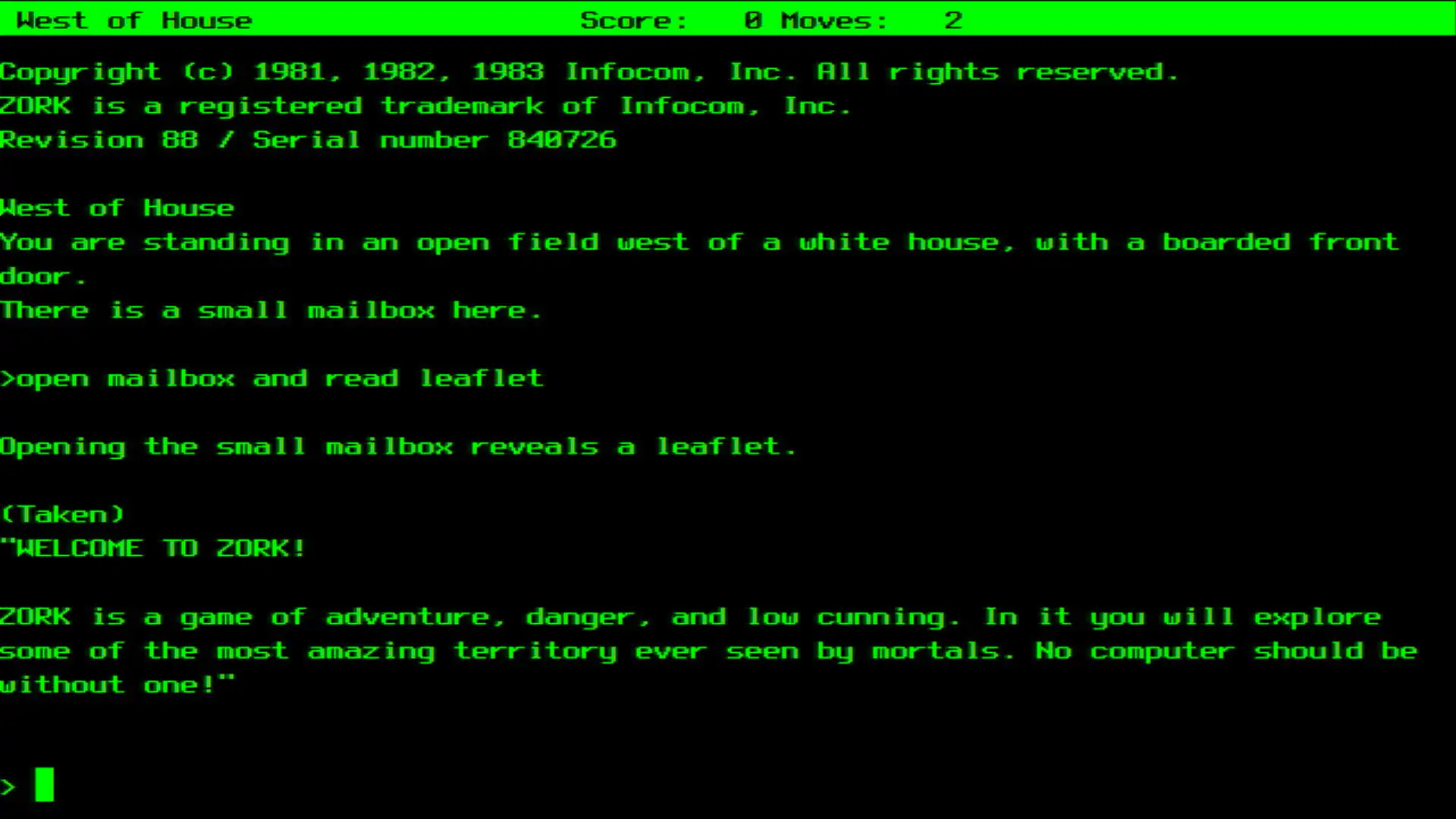
Both were verb-first. "Run," "attack," "open," "compile." You started with an action and told the machine what to do. There were no screens to browse before acting. Both assumed you'd learn through doing. Enter a wrong command, get an error, adjust, try again. Both rewarded mental models over menu discovery. Once you understood how the system worked, you could move fast.
The problem was that you had to speak the computer's language. Literal commands, precise syntax, unforgiving punctuation. It wasn't truly magic. More like spells you memorized and hoped you didn't mispronounce. The interaction grammar was powerful, but the barrier to entry was brutal. Most people couldn't use computers at all.
Then GUI happened.
What is GUI?
Graphical User Interface (GUI) is the visual layer that lets you interact with a computer by clicking icons, buttons, and menus instead of typing commands. Every software you've ever pointed at and clicked is a GUI.
Not because a single genius woke up one morning and invented it. It was a long relay race, and each hand the baton passed through changed the grammar in a specific way.
A Brief History of the Graphical User Interface
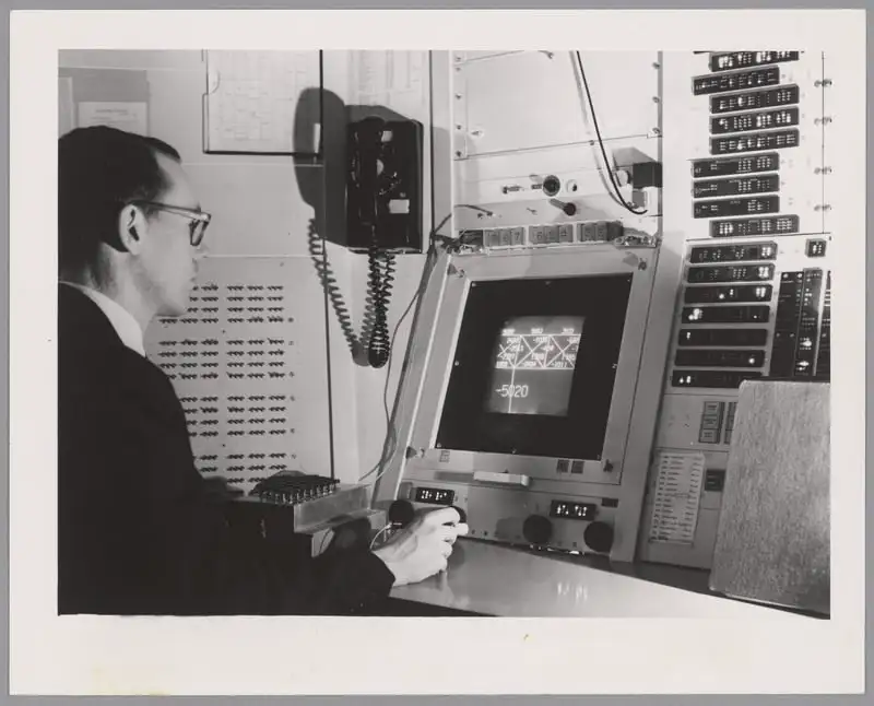
Ivan Sutherland built Sketchpad at MIT in 1963, the first program to let you draw and manipulate graphical objects directly on screen. This was the first crack in the wall: instead of describing what you wanted in text, you could point at things and move them. A new input, direct manipulation, entered the grammar.
Then Douglas Engelbart and his team at Stanford Research Institute (SRI) staged what we now call "The Mother of All Demos" in 1968. It wasn't just a demo of a mouse. It was a demo of a philosophy: interactive computing as augmentation. It looked suspiciously like the future showing up early to a conference, because it had Windows, hypertext, and even collaborative editing. But here's what matters for our story: Engelbart added a pointing device to the grammar, but kept the verbs. His system was still deeply command-heavy. You pointed and typed. The grammar expanded.
In 1970, Xerox PARC was founded with a deceptively ambitious question: What does the office of the future look like?Alan Kay and his team did the unglamorous work of turning these ideas into something coherent, and in doing so, made the choice that would define software interaction for the next half century. They formalized the "WIMP" paradigm: Windows, Icons, Menus, Pointing device. Gone were the days of commands and Menus took over. The grammar stopped being about what you said and started being about where you looked at. Xerox released the Star in 1981, the first commercial computer with a GUI, but it was too expensive to catch on.
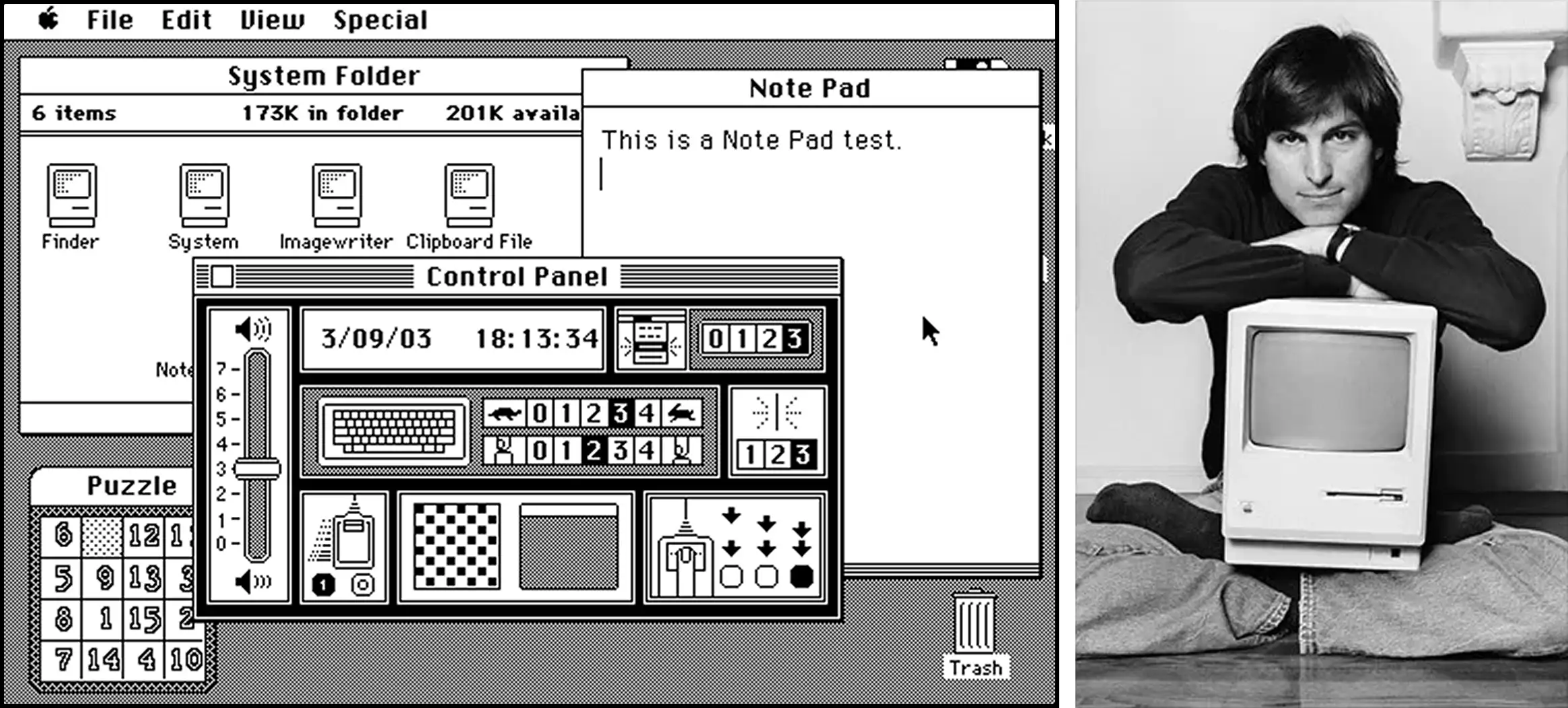
Apple then did what Apple often does, and does it brilliantly: took a powerful idea, compressed it into something people actually wanted, and shipped it. Visits to PARC influenced Apple's direction, and that line runs through the Lisa (1983) to the Macintosh (1984), where the GUI became less of a research artifact and more of a cultural event. The first commercially successful computer you could point at and click. The WIMP grammar went mainstream.
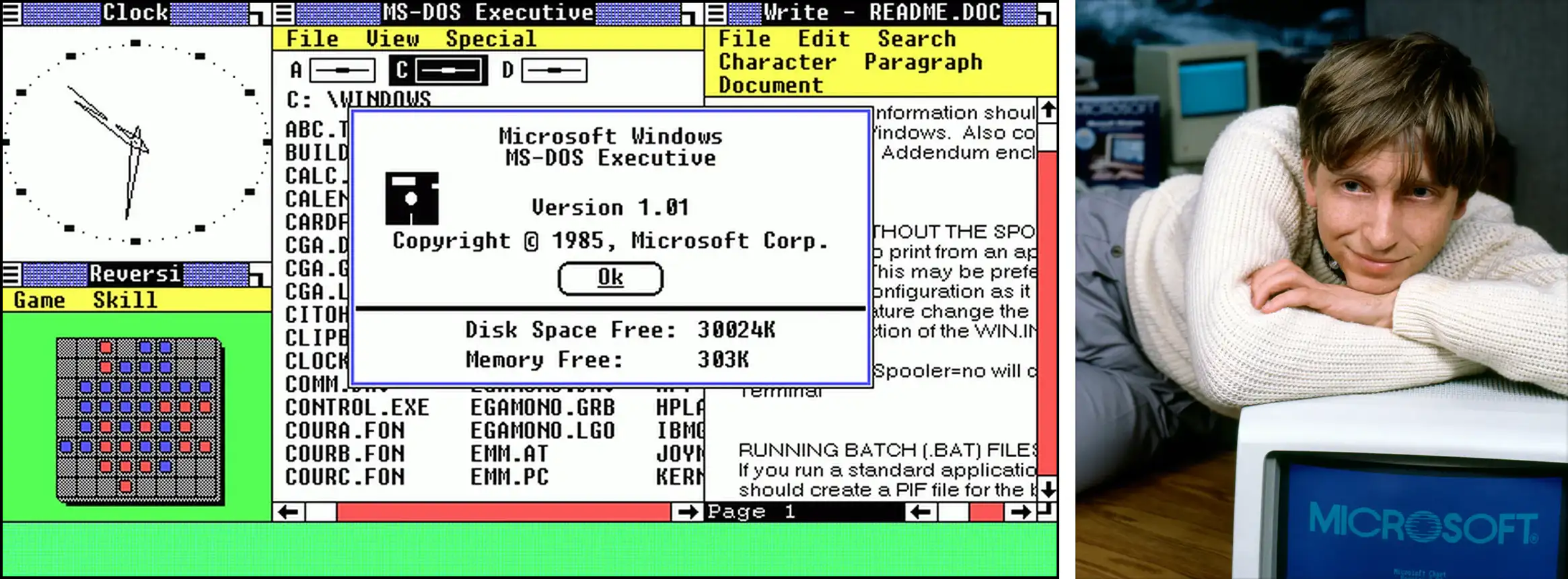
In 1985, Microsoft followed with Windows 1.0, and the grammar became the default expectation for all of computing. Billions of people would learn to use computers through this exact set of primitives: windows, icons, menus, and a pointing device.
That very same year, Nintendo released Super Mario Bros.
So why did Nintendo's interactions feel magical in 1985, while Apple's "Magic Mouse" still struggles to feel right decades later?
The Original Sin: When Games Chose Motion and Software Chose Menus
The difference wasn't technology or talent. It was what each interface believed the user was there to do.
GUI solved real problems: discoverability for non-experts, visual feedback, reduced memorization, lower barriers to entry. It brought computing to everyone. But to do that, it made one fundamental trade-off:
It moved intent after navigation.
That's the original sin. Instead of "Do X," as in games and early command-based systems, you now had to "Find where X lives → then do X."
The interaction grammar went from expressing intent to navigating structure. Once that grammar was locked in, once billions of people learned to use computers through WIMP, it became almost impossible to change.
But the original sin names the what. It doesn't explain the how. How exactly does an interface turn every intention into a navigation problem? The answer starts with a single button on a beige plastic mouse.
The Problem With the Click: Limits of Modern User Interface Design
Why "Click" is the Devil
Engelbart's mouse had one button. Click.
Think about that word. "Click" is a sound that switches make. It has no inherent meaning. It doesn't do anything. It borrows meaning from whatever label you click on. Click turned intent into navigation. Every time you find yourself wondering what you wanted to do, you're actually thinking about where to deploy a click.
That makes the mouse dangerous. Also the most powerful input device we've built.
The mouse unlocked pointing, pressing, and releasing: spatial reference, selection, direct manipulation. Revolutionary, but note the shift.
Meaning moved from context to label.
In Mario, "jump" means different things because the world around you changes. In a GUI, "click" means different things because the words next to your cursor change. The verb is hollow. The nouns do all the work.
There's a name for what Mario has and GUIs lost: situated meaning. It's when an action derives its meaning from the state you're in and the context around you, not from a label someone wrote on a button. In Mario, you don't read the word "kill" before stomping a Goomba. The meaning is in the situation: enemy below you, you're falling, impact happens, enemy dies. The action means what it means because of where you are when you do it.
Click has no situated meaning. It means nothing until a label tells it what to mean. That single fact, one hollow verb carrying the entire weight of human-computer interaction, is how we ended up with a thousand clicks to do one thing.
The Devil's Bargain
Now, one might say that you can't design software like a game. And I don’t agree with that, not today.
Games could keep situated meaning because they had structural advantages software doesn't. A game has a world with a point of view. The player enters a narrative, inhabits a character and moves through a choreographed experience. New mechanics can be introduced gradually, wrapped inside the story itself. Complexity gets revealed over time. The interaction grammar grows as the player grows.
Software had none of that. Work tools had to be immediately useful to beginners and still powerful enough for experts. They couldn't assume training. They couldn't hide capabilities behind progression. Everything had to be visible, accessible, and defensible from day one. Permission systems, roles, audit trails, undo safety, all eggs in the same basket. Software needed to be safe, flexible, and accountable.
So software made a bargain: give up situated meaning in exchange for discoverability and structure. Instead of choreographing experience, expose everything. Make every capability findable. Put it in a menu. Label it. Ship it.
That bargain was reasonable. Maybe even necessary. But here's what made it the devil's bargain: it compounded.

Every new feature needed a place in the menu. Every place needed a label. Every label needed to not conflict with the other labels. So teams added submenus. Then settings pages. Then tabs within settings pages. Then search bars to search the settings. The grammar never expanded (it was still just click, read, navigate, click) but the surface area it had to cover kept growing. Each generation of software made the maze bigger without giving you a better way to move through it.
Then the mouse got a second button. Right-click, click's sidekick. You use it to summon a context menu. Options were brought to you instead of you going to find them. Even the solution to the navigation problem was another menu. More nouns. More labels. The grammar stayed exactly the same.
This is why the problem has persisted for forty years. It's not that designers are careless. It's that the bargain software made in the 1980s created a pattern that reinforces itself. You can't fix a compounding grammar problem by adding more features on top of it. You need to change the grammar.
The Future of UI/UX: Context-Aware and Intent-First Interaction Design
World 1-2: The Next Level of Interaction Grammar
So what would it look like to bring situated meaning back into software? Not as a theory, but as something you can actually use?
It's already happening in tools most people haven't heard of, albeit in small ways.
My favorite example is a Mac app called Dropover by Damir Tursunovic. You select a file, start dragging it, and then shake your mouse. A small shelf appears, a temporary drop zone. You drop the file there, navigate to another folder, pick up another file, shake again, drop it on the same shelf. When you're ready, you drag the whole collection wherever it needs to go.
Think about what just happened. "Shake" is a meaningless gesture on its own. But when you're already dragging a file, shake becomes "I need a place to put this temporarily." The gesture has no inherent meaning, just like Mario's jump button. It gains meaning entirely from the state you're in when you perform it. Situated meaning, alive inside a productivity tool. Imagine your current workflow of selecting 10 files that are in 5 different folders and airdropping them. How mentally challenging that is!
There's another app called Monocle by Dominik Kandravy. You shake your mouse and it puts you into a focus mode: hides the menu bar, hides the dock, blurs every app in the background except the one you're working in. One gesture replaces what would normally be a journey through Settings → Focus → choose a mode → configure it → activate it. You wanted to focus. You shook the mouse. You're focused. Intent expressed as a verb, not routed through navigation.
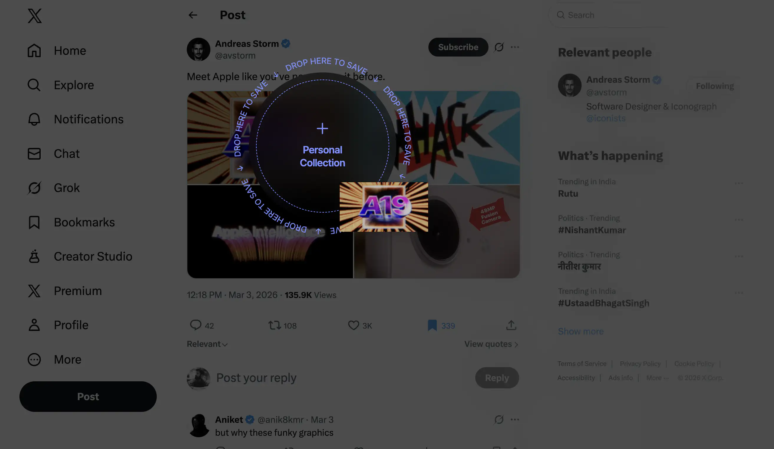
You're scrolling X and you see a cool image you want to keep for later. Right now you'd probably bookmark it and never look at it again. But what if you could just drag the image and a drop zone appears? You drop it and it's saved. No "Save to folder" dropdown. No right-click menu with eight options. You drag, and the destination gives your action meaning. One verb — drag, and the context multiplies it. Verb leverage, built into a workflow.
Why intent-first interaction grammar hasn't gone mainstream
These are indie tools built by small teams for niche audiences. They're not trying to reinvent computing. But they carry a principle that most mainstream software has forgotten: the interaction can carry the meaning. You don't always need a label to tell the user what's happening. Sometimes the state they're in is the label. The new-age interaction principles implemented by small tools haven't reached the products billions of people use every day. Why not?
Because the incentive structure of software development still rewards feature count over interaction quality. It's easier to ship a new capability behind a new menu than to redesign how existing capabilities are accessed. Product teams get evaluated on what they shipped, not on how it felt to use. The compounding pattern from the devil's bargain is still the default: new feature, new menu item, new label, ship it, move on.
Other than the obvious, there's a deeper reason. Redesigning interaction grammar is hard in a way that adding features isn't. A new feature is additive. You can bolt it on without touching anything else. But changing how a user expresses intent means rethinking the foundations. It means questioning whether the toolbar should exist in its current form, whether settings should be a destination at all, whether the right-click menu is solving a problem or just relocating one. Most teams don't have the time, the mandate, or the appetite for that kind of work.
But every new product being built right now is still making the primitive interaction grammar choice, whether the team knows it or not. Most are making it by default, reaching for the same menus and modals and settings pages that every product before them used. The ones that think about it differently will feel different to use. Not because they have fewer features, but because the features they have are expressed through richer verbs.
Rethinking the grammar of interface interaction does not require AI, though AI can help. An LLM that interprets "turn off notifications for this app" and maps it to the right toggle is useful, but it's a patch on the navigation problem. The deeper opportunity is using contextual awareness to reshape the grammar itself: fewer nouns on screen, more verbs that mean something — based of where you are and what you're doing.
If you're building software right now, know this: every time you add a menu item instead of rethinking an interaction, you're choosing the same path that got us here. You're making the maze one room bigger and calling it a feature.
Nintendo had two buttons and asked: how do we make each one mean more? You have touch, voice, spatial computing, and AI. The question isn't what your product can do. It's how little it should ask of the person using it.
That would be something worth clicking on.
FAQs
1. What is interaction grammar in UX design?
Interaction grammar is the set of inputs an interface gives you (click, type, drag, swipe) and the rules that determine what those inputs mean in context. When the grammar is rich, a few inputs can express many intentions. When it's poor, users end up navigating menus to do simple things. Most modern software runs on the same interaction grammar that was established in the 1980s with the WIMP paradigm (Windows, Icons, Menus, Pointing device).
2. What can game design teach us about UX?
Games like Super Mario Bros. solve interaction problems that most software still struggles with. Mario teaches mechanics through consequences instead of instructions, uses context to give a single input multiple meanings, and increases complexity without adding new controls. These principles, verb leverage and situated meaning, apply directly to productivity software but are rarely used outside of games.
3. Why does modern software feel hard to use despite good UI?
Most software isn't difficult because of bad visual design. It's difficult because the interaction grammar is menu-shaped: every action hides behind layers of menus, labels, and settings pages. Users are forced to navigate structure before they can express intent. A simple task like turning off notifications can require dozens of steps, not because the interface looks bad, but because the underlying grammar hasn't evolved in forty years.
4. What is the WIMP paradigm?
WIMP stands for Windows, Icons, Menus, and Pointing device. It was formalized at Xerox PARC in the 1970s and became the standard interaction model through Apple's Macintosh (1984) and Microsoft Windows (1985). WIMP made computers accessible to non-experts by replacing typed commands with visual elements you could point at and click. However, it also shifted the interaction grammar from expressing intent to navigating structure.
5. What is verb leverage in interaction design?
Verb leverage is the amount of meaning a single input can carry across different situations. In Super Mario Bros., one button (jump) means dodge when you jump over an enemy, kill when you jump onto one, and collect when you jump into a block. The input stays the same but the context changes its meaning. High verb leverage means fewer controls that do more, instead of adding a new button for every new function.
6. What is situated meaning in UX?
Situated meaning is when an action derives its meaning from the state the user is in and the context around them, rather than from a label on a button. In Mario, you don't read the word "kill" before stomping an enemy. The meaning comes from the situation: enemy below you, you're falling, impact happens. Most GUI software lost situated meaning by making "click" a hollow verb that only gains meaning from whatever label it's pointed at.
7. Why are software interfaces still menu-shaped?
Three reasons. First, menus are cheap to build: new feature, new menu item, done. Second, the incentive structure of software development rewards shipping features, not rethinking interaction grammar. Third, the pattern compounds and reinforces itself. Every new feature makes the menu approach feel more necessary, making it harder to imagine an alternative. The result is forty years of the same grammar with an ever-growing surface area.
8. How can AI improve interaction design beyond chatbots?
AI can interpret natural language intent (like "turn off notifications for this app") and map it to the right action, but that's a patch on the navigation problem, not a fix. The deeper opportunity is using AI's contextual awareness to reshape the interaction grammar itself: reducing the number of labels on screen and making inputs carry meaning based on what the user is doing and where they are, rather than routing every action through menus.