Most beautiful things are designed when there is a constraint.
A constraint of space, time, or resources puts designers in a rough spot, nudging them to be creative and smart with their style to get out of it–you don’t want to be too comfortable in your style.
The fresh-in-demand Bento Design System is an example of constraint in style (and space).

Apple – Wanderlust, 2023
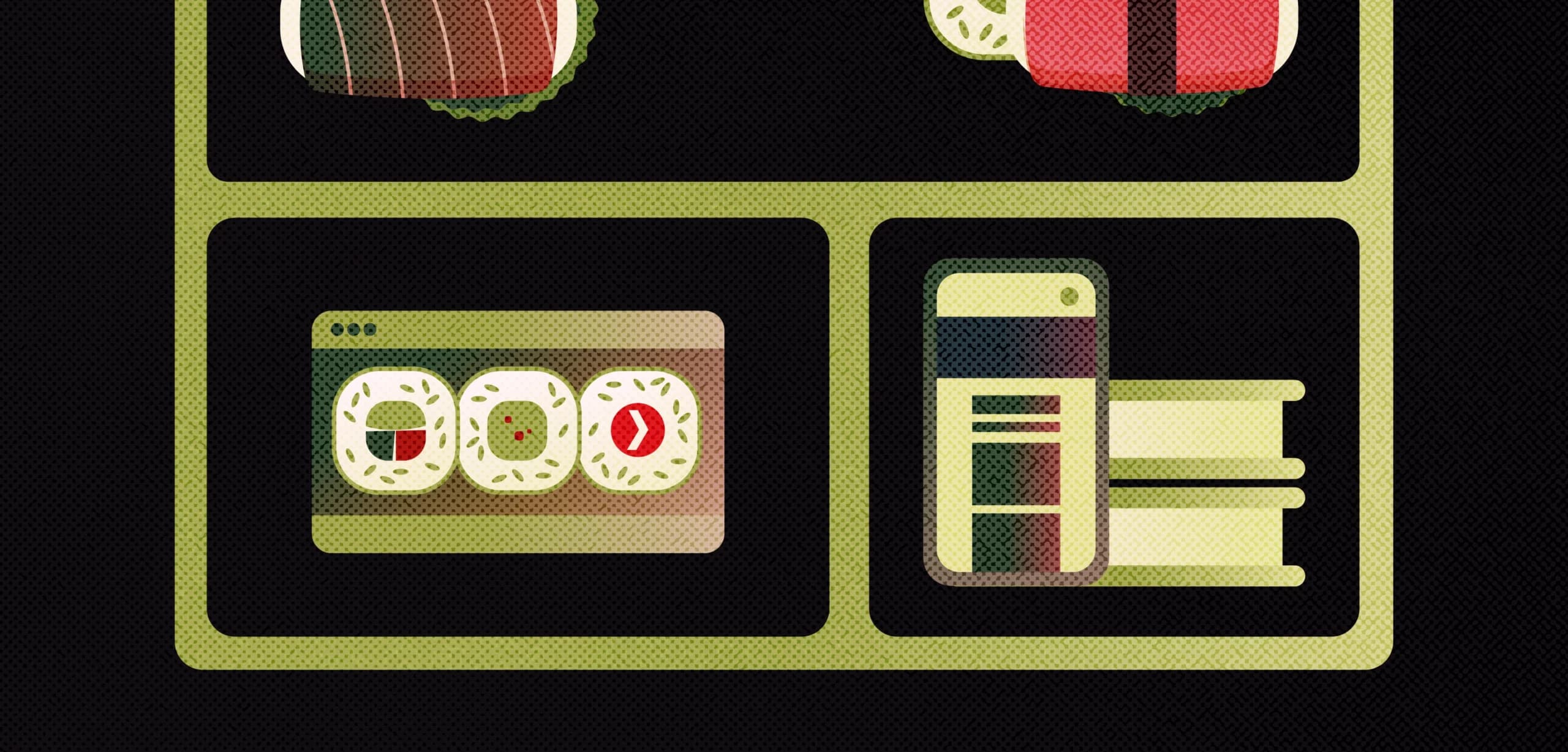
In the real world, a bento may only be a Japanese lunchbox that contains a variety of small, carefully arranged portions, where each compartment packs a different type of food, such as rice, vegetables, or even sushi. But in the design world, the bento has been a powerful vision that helps designers make sense of complex information and create cohesive user experiences.
It gives you all the variety you could ever want in a single meal, without sacrificing taste, quality or even appearance.
The idea behind the Bento Design System is to provide a set of predefined styles and components that designers can tweak and have fun with. Especially considering a bento’s style serves its one true all-in-one purpose, embodying the essence of convenience in consumption. The best possible trait for UI.
Bento works in simple ways:
1. If you want your layout to talk about many things, communicate them clearly and as fast as possible
2. Use visual hierarchies and concise content if you have limited space and time to do it
In UI, this concept involves breaking down a complex system or interface into modular components or compartments. Each component has a specific function or content, making it easier for users to understand and navigate the system.
While the bento’s origins are disputed, Apple was one of the first pioneers to base their design philosophy on it.
Starting with the original macOS control panel in Macintosh, circa 1984.
In 1982, fine artist Susan Kare played a major role in designing much of its visual language. Kare drew new Macintosh icons and elements, drawing from her past experiences in mosaics, needlepoint, and pointillism.

macOS Control Panel, 1984
Her design motto followed three key principles:
Meaning, memorability, and clarity.
Users could easily customize various aspects of their Mac, such as volume, background patterns, mouse settings, keyboard preferences, and more, all in one panel.
A simple recipe for a simple meal box. Maketh thee Sushi Master proud.
How does the bento really help a user? 💡
According to the Aesthetic-Usability Effect UX Law,
An aesthetically pleasing design creates a positive response in people’s brains and leads them to believe the design actually works better.
With its clean and minimalist layout, the Bento makes it easy for attendees to digest the information presented quickly.
The color scheme and typography choices must also inform the theme and imagery, making it a designer’s ultimate knight in shining armour. Unfortunately, you can’t wish your own knight into existence.
You have to put in the work. This brings us to the next question.
Just how do you make your own bento box? 🍱
To make a bento, we start with its purpose. What are we trying to achieve out of this bento? What do you want your bento to do?
– Is the purpose of the bento to showcase features of your product — be it digital or physical?
– Is the purpose of the bento to highlight key points or to give a summary of everything?
– Are you just looking to spice things up from age-old column structures?
– Or, will it be printed on a t-shirt just to look snappy?

Once you have found your reason, remember it when you work. It’ll be the lifeline of your bento-making process. You never want to start with a basic grid and add filler content in compartments later. Otherwise, it might ruin your grid.
Remember: A bento might be modular but its possibilities are endless—limited only by the imagination.


