Apple doesn’t just invent the future—it remembers the past to shape it.
Like great authors who bury meaning between the lines, Apple hides its values, memories, and ambition in the fine print of its design. You just have to know where to look.
These quiet acts of genius are what make Apple’s products feel less like tools, and more like artifacts. Each with its own story. Each whispering something just beneath the surface.
Here are 6 Easter eggs that spotlight Apple’s secretive obsession with details.
iPhone 16 Wallpapers: A Hidden Camera Blueprint
If there’s one thing Apple knows, it’s how to refine without repeating.
The latest iPhone 16 launch was about a deeper fusion of AI and software. While some might argue that Apple plays it too safe with its designs, there's something to be said about the brand’s ability to evolve without losing its mojo.
Speaking of mojo, the iPhone 16 lineup’s default wallpapers aren’t your run-of-the-mill pretty gradients. They hinted at each model’s camera system, according to tech blogger John Gruber.
- The iPhone 16e wallpaper features a single, prominent circle, subtly representing its lone rear camera.
- The iPhone 16 gets two vertically aligned circles, mirroring its dual-camera setup.
- The iPhone 16 Pro has three circles for its triple-lens array.
Most users will never notice. But for Apple, even background art is a chance to reinforce its design philosophy: hardware and software, always in sync.
MacBook Air’s Optical Illusions
The 15-inch MacBook Air ships with a wallpaper that, at first glance, feels like any other abstract Apple design. But look closer. Woven into the swirls and curves is a barely visible word: “Air.” A whisper of branding, hidden in plain sight.

It’s classic Apple—clean, understated, and playful. A surprise for those paying attention.
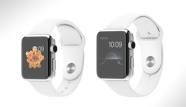
The Apple Watch Time Trick
Apple’s relationship with time isn’t just practical—it’s poetic.
Every Apple Watch promotional image displays the time as 10:09—a deliberate departure from the traditional 10:10 that is typically used in watch advertising for symmetry. That one-minute shift? It’s a quiet flex. A message that says, “We’re not here to follow traditions—we’re here to redefine them.”
And then there’s the iconic 9:42 AM, the time stamped on every iPhone in launch images. This is no accident. It’s the exact moment Steve Jobs introduced the very first iPhone in 2007.
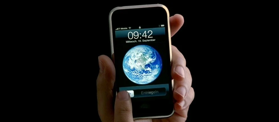
These moments aren’t just design quirks. They’re timestamps in Apple’s mythology—small anchors that connect the present to the moments that made the brand iconic.
The Finder App’s Happy Face
The Finder app’s icon, which features a smiling face, is not simply a whimsical design detail. It’s a reference to the original “Happy Mac” icon from the 1984 Macintosh—forever a symbol of the personal computer revolution.

In a sea of minimalist icons, the Finder’s face remains cheerfully distinct—a gentle reminder of Apple’s roots in making tech feel human.
The Calendar and Clock Icons
If you thought the Calendar and Clock icons on macOS are plain static images, think again.
They actually update in real-time, showing the current date and ticking clock, making even the homescreen feel alive. Subtle and very Apple!
The Numbers in Apple’s Notes & Reminders
Peek closely at the default text in Notes and Reminders, and you’ll find nods to iconic keynotes, classic Mac ads, and even inside jokes from Apple’s design team.
Since OS X 10.5 Leopard, TextEdit has included a more readable version of the “Crazy Ones” text. Meanwhile, "John Appleseed" serves as Apple’s default placeholder name, akin to "John Doe."
The Subtle Art of Apple: A Branding Superpower
"People DO judge a book by its cover. We may have the best product, the highest quality, the most useful software etc. If we present them in a slipshod manner, they will be perceived as slipshod; if we present them in a creative, professional manner, we will impute the desired qualities.” — Mike Markkula, 1977
These small but meaningful details are part of a larger story about Apple’s culture.
In these seemingly mundane apps, wallpapers, icons, placeholder text, Apple’s design team found a way to tell a story. Most users will never notice. But longtime fans feel it instantly.
At first glance, these might seem like mere playful details, but they are anything but random. Apple isn’t just adding Easter eggs for the sake of fun. It’s reinforcing a deeper brand philosophy.
While other brands focus on features and hardware specs, Apple builds mythology. Each small design decision reinforces a sense of legacy, exclusivity, and intelligence. These aren’t just products. They are belief agents, making people feel part of something bigger simply by using an Apple device.
That’s the real magic: these details create an emotional, almost subconscious connection between users and the brand. They transform technology into something personal, familiar, and full of meaning.
And that’s the secret ingredient other brands often miss.
Apple’s real superpower? Turning everyday tech into personal ritual. Not just through design—but through story. And story is something specs alone can never match.
Maybe that’s what makes Apple more than a brand. It’s a belief system. A quiet step toward a Mental Market Monopoly—where loyalty isn’t earned through logic, but through meaning.
.webp&w=2048&q=75)